Building a design
operating system for
six products at once.
How I designed UNICORN, a shared component architecture, governance system, and token framework that governs CTA design, brand adaptation, compliance, and UI consistency across PlayUSA, Bonus.com, Gaming Today, LegalSportsReport, and Lineups.
The problem
Catena Media operates six affiliate products in the US gambling market. Each product had independently designed CTA components, different card structures, different compliance approaches, different mobile layouts, different token systems. The result was duplicated design effort, inconsistent user experiences, and no ability to roll out improvements across the portfolio simultaneously.
The deeper problem was governance. When compliance requirements changed, which they did constantly, given the regulatory complexity of US gambling law, each product had to update independently. There was no single source of truth.
"The question was not what a better CTA card looks like. The question was how to design one system that six products can inherit, and that still allows each brand to feel distinct."
The UNICORN architecture
UNICORN is the base component layer. Every product inherits from it by swapping brand tokens, accent colour, logo, button treatment, while the underlying anatomy, compliance logic, and interaction states remain consistent and centrally maintained.
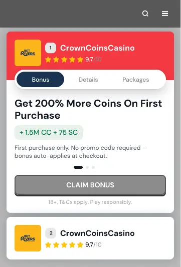
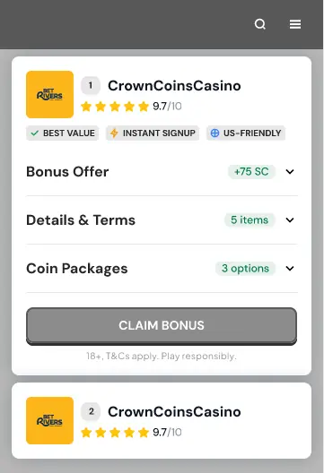
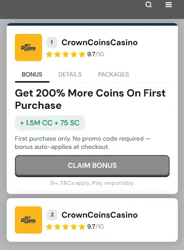
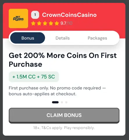
The CTA Card became the centrepiece. After extensive research and iteration, four mobile variants were designed, Classic (centered tabs), Accordion Stack, Segmented Swipe, and Hybrid (tabs + trust), each sharing the same structural engine and compliance framework, differing only in how they arrange and reveal content to the user.
Shared anatomy
Every variant uses the same building blocks: Identity row, Bonus panel, Details panel, Regulatory panel, and CTA footer. The only thing that changes is how those blocks are arranged and revealed. This means compliance updates propagate instantly across all six products.
Brand token inheritance
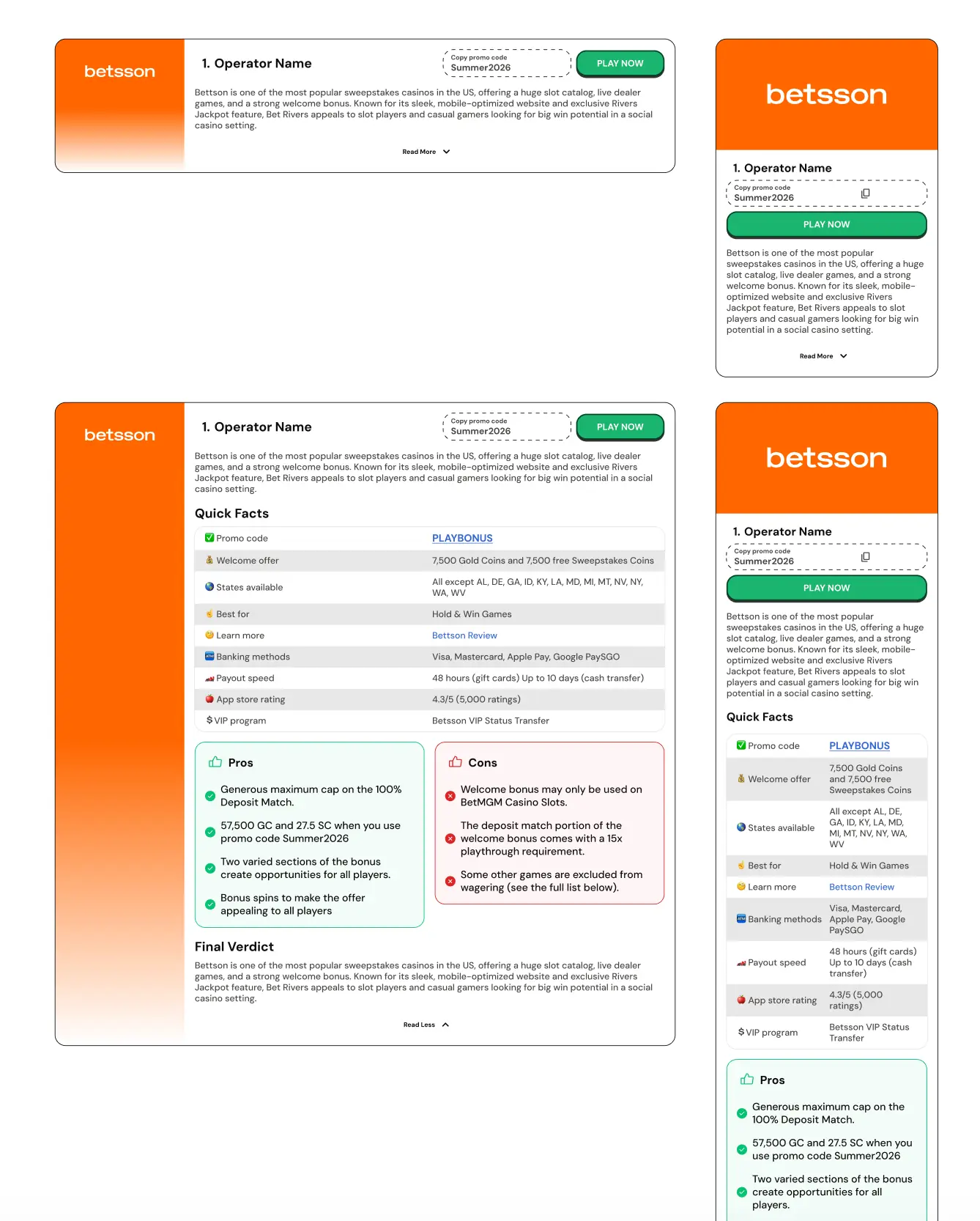
PlayUSA, GamingToday, and Bonus.com inherit the UNICORN component and swap the accent token. One Figma file. One CTA card. Three brand expressions. This reduced per-brand design overhead and limited divergence over time.
Compliance built into the system
One of the most consequential design decisions was the structural separation of marketing content and compliance content within the CTA card. The existing system allowed legal disclaimers, responsible gambling warnings, T&C text, to be injected into the benefit list as green checkmark items. This created a semantic contradiction: checkmarks signal positive value, but disclaimers are neutral or negative legal obligations. The UX damage was real: it diluted the actual value propositions, reduced conversion clarity, and created indirect compliance risk.
The solution was architectural: the card was divided into three distinct content zones, the Primary Offer, the Benefit List (strictly value propositions), and the Regulatory Panel (compliance content). Content editors cannot mix them. This is governance enforced by component structure, not by documentation alone.
When compliance is a documentation rule, it gets broken. When it is enforced by the component's architecture, it cannot be broken. The best governance is invisible governance.
Dynamic behaviour
The toplist CTA card features dynamic layout behaviour: when a promo code is available, the card reserves space for the promo code field alongside the CTA button. When no promo code exists, the CTA button automatically expands to use the full available width, creating a larger, more prominent click target without any manual layout adjustment. This behaviour is driven by content state, not by a designer deciding case-by-case.
Similarly, the Bonus Harvester Cards, the auto-scrolling strip of bonus cards on Bonus.com, underwent three design direction iterations in direct response to user feedback: scroll speed was too fast, descriptions consumed too much card space, and users were unsure the cards were clickable. Three directions were designed and documented, each with different animation behaviour and hover states, before a recommended direction was selected.
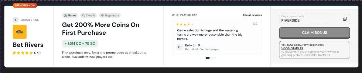
Social proof variant
Alongside the standard CTA variants, a Social Proof variant (Variant G) was designed specifically for PlayUSA, the product with the most player reviews and community interaction. It introduced three psychological triggers: a Trending pill (editorial signal, manually assigned by editors), a Signup Ticker (herd momentum), and a Review Carousel (peer credibility). Together they create a "real people, real numbers, right now" feel that authoritative reviews alone cannot deliver.

Filtering and sorting the toplist
One of the more strategically significant additions was the toplist filter and sort layer. The hypothesis: toplists currently read like advertisements. Adding sort and filter controls makes them feel like a tool the user operates, which raises trust, perceived usefulness, and therefore interaction rates.
Two distinct control types were designed: sorting reorders the entire list by one attribute (offer value, payout speed, number of games); filtering narrows which brands appear. They are independent and can be combined. Rank badges update in real time as the list re-sorts. The distinction between sorts (full-list re-ordering, shown as buttons) and filters (brand narrowing, shown as dropdowns) was a deliberate decision based on cognitive load and user mental models.
Login modal system
The login and registration modal was designed in three variants, Classic, Split, and Branded, all sharing one component library, copy system, validation logic, and accessibility behaviour. They differ only in layout and how much they sell the product before asking the user to commit. The recommendation was to route the layout by trigger rather than shipping a single fixed variant: Classic for returning users accessing a locked feature, Split for first-time sign-ups where conversion is the goal, Branded for high brand-moment touchpoints and mobile.
Icon library & motion system
The UNICORN Icon Library is a curated set of reusable SVG icons covering casino, sports betting, promotions, editorial, utility, and emerging content experiences, all exported and hosted in a SharePoint repository accessible to product teams. Every icon is marked as Ready before inclusion in the library.
The loading animation designed for LINEUPS widgets, a sequential letter-stroke draw of the LINEUPS wordmark, established the motion language for the sports product. Letters draw left to right, following reading direction, creating a loop that feels intentional rather than generic. The animation was designed with performance as a constraint: the best approach for export and implementation was discussed with developers before finalisation.
Outcome
Qualitative assessment of the work.
Standardising the CTA architecture across six products reduced duplicated design effort that had previously required separate decisions, separate components, and separate QA for each brand. Engineering teams gained implementation certainty: one component specification, documented acceptance criteria, and a token system that enforces brand differentiation without structural divergence.
Compliance governance moved from documentation (rules that could be ignored) to architecture (rules that cannot be broken). The structural separation of marketing content and regulatory content made it impossible to inject legal disclaimers into benefit lists, removing a category of compliance risk. The proposed dynamic contrast engine addresses a second category of risk: CMS-driven colour changes producing unreadable text combinations without an automatic correction.
The system created a shared design language between Product, Design, and Engineering for the first time, reducing the translation cost of every conversation about component behaviour, brand expression, or compliance requirement. When a component is updated at the UNICORN level, six products inherit the improvement simultaneously. That is the compounding return that component governance was always supposed to deliver.