Improving conversion
without breaking
what already works.
A sustained programme of audits, structural redesigns, and product improvements across three high-traffic platforms, guided by a consistent principle: fix hierarchy first, then monetise.
The overarching problem
Affiliate platforms in the US gambling market face a structural UX tension: they need to surface high-value operator offers as quickly as possible for commercial reasons, but users arrive with questions, not buying intent. They want to know if betting is legal in their state, which operator is right for them, and whether they can trust the site. Presenting operator offers before answering those questions converts less, not more.
Across PlayUSA, Bonus.com, and Gaming Today, the same patterns repeated: pages were too long, too dense, and structured around content volume rather than user journeys. Monetised offer content appeared before trust signals. Navigation buried the pages users most needed to find. The result was elevated bounce rates, mobile scroll fatigue, and conversion paths that leaked at every stage.
"Trust before offers. Hierarchy before content. Structure before style. These were the three principles applied across every audit."
Understanding who arrives and why
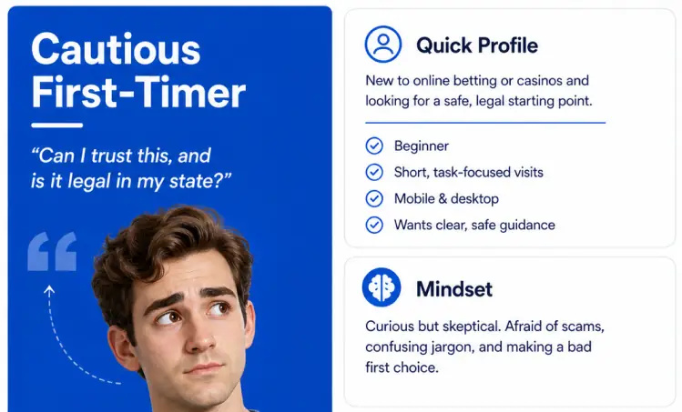
Every page audit began with a user persona framework before any design recommendations were made. Three distinct arrival modes were identified across all affiliate pages: the Cautious First-Timer (new to online betting, afraid of scams, asking "Can I trust this and is it legal in my state?"), the Comparison Shopper (wants to compare options fast without decoding legal status first), and the Ready-to-Act User (wants confirmation of eligibility and a direct path to the offer). Most existing page structures were optimised for the third persona while doing little to support the first two.
PlayUSA homepage audit
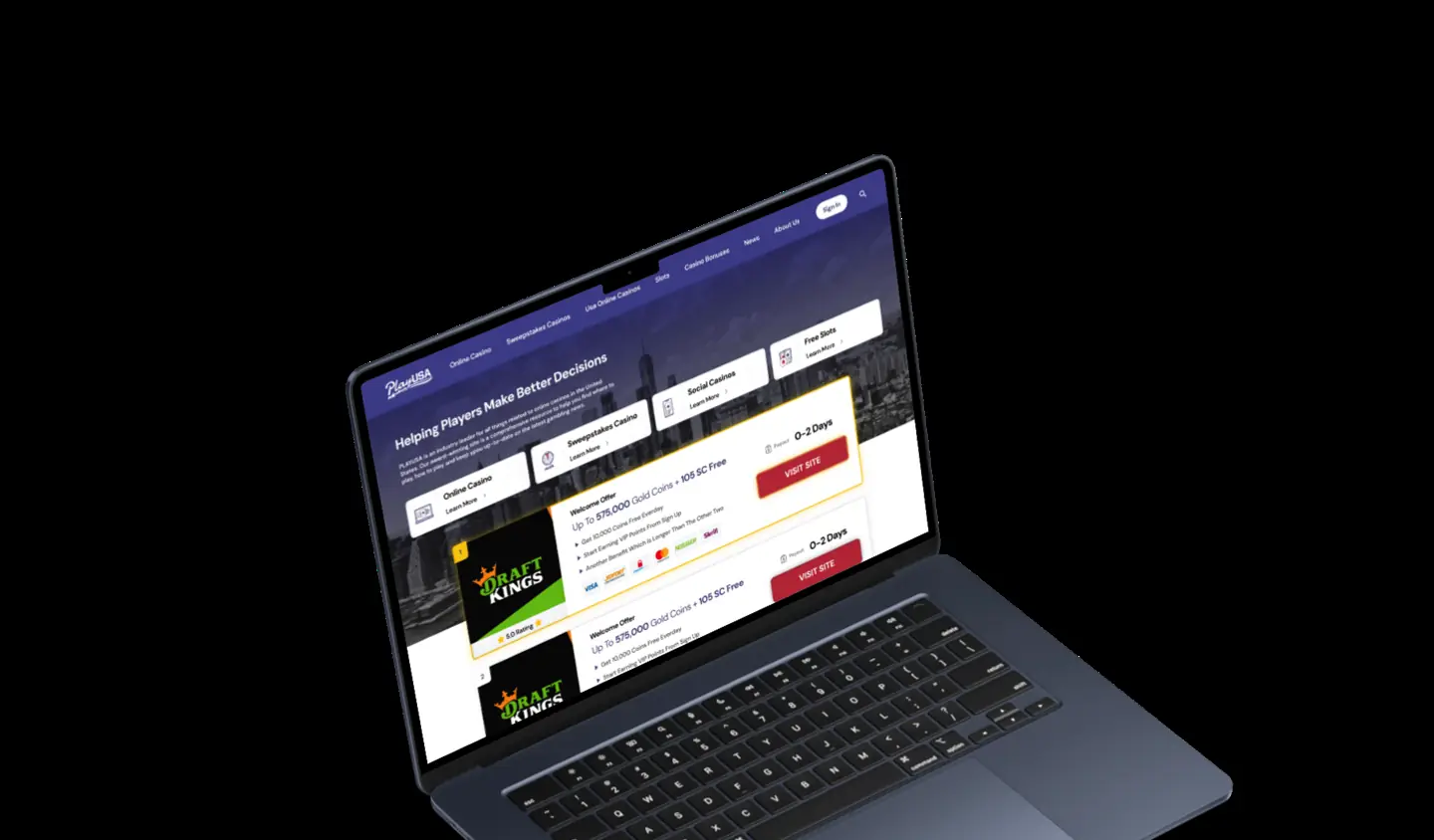
The PlayUSA homepage had grown without strategic governance. Content editors operated in WordPress without clear layout constraints, creating inconsistency across sections. The visual hierarchy was weak, no single element dominated, making the page harder to scan. Branded visual assets existed but were underused, leaving the page looking more like a text archive than a product.
The audit identified the highest-impact opportunities: reducing text density, strengthening hero section hierarchy, improving branded asset usage, and establishing layout constraints within the WordPress setup to prevent further drift. The work also identified that mobile received no specific treatment, desktop layout was simply compressed, creating a poor reading experience on the platform where most users arrived.
PlayUSA TOP25 rework, /online-casinos/, /bonus/, /sweepstakes/
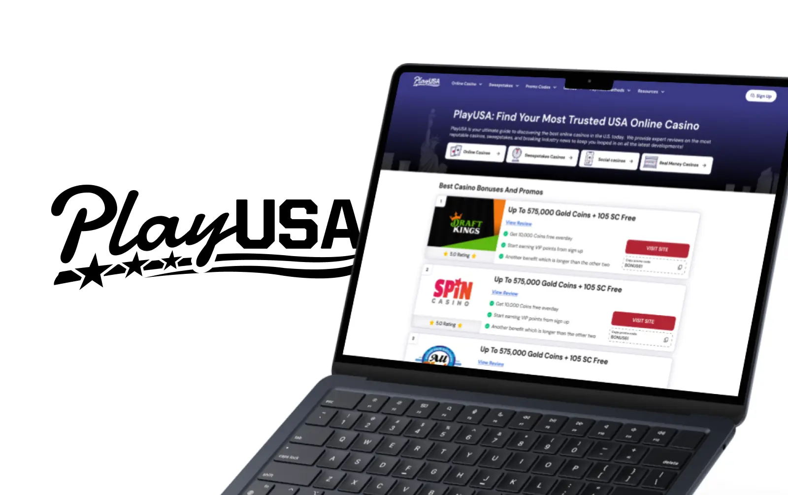
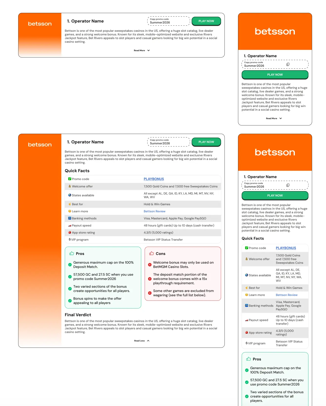
Three high-traffic page types were audited and redesigned as part of the TOP25 project. Each had the same structural problem: the page opened with a long operator list before users had enough context, trust signals, or editorial guidance to make a comparison decision. This created what the documentation described as "editorial sprawl rather than structured guidance."
The redesign applied a consistent principle across all three pages: lead with trust and context, then present operators. The opening section establishes who the site is, what the page covers, and why the user should trust the recommendations, before any CTA card appears. UNICORN blocks were used throughout to create visual consistency and modular flexibility.
The redesign aimed at clear UX improvements: reduced perceived page length, less scroll fatigue, clearer section separation, and stronger visual pacing. The design is shorter not because content was removed, but because content was reordered by user need rather than by publishing convenience.
Toplist tabs, segmenting user intent
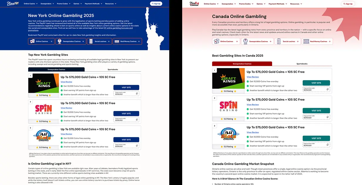
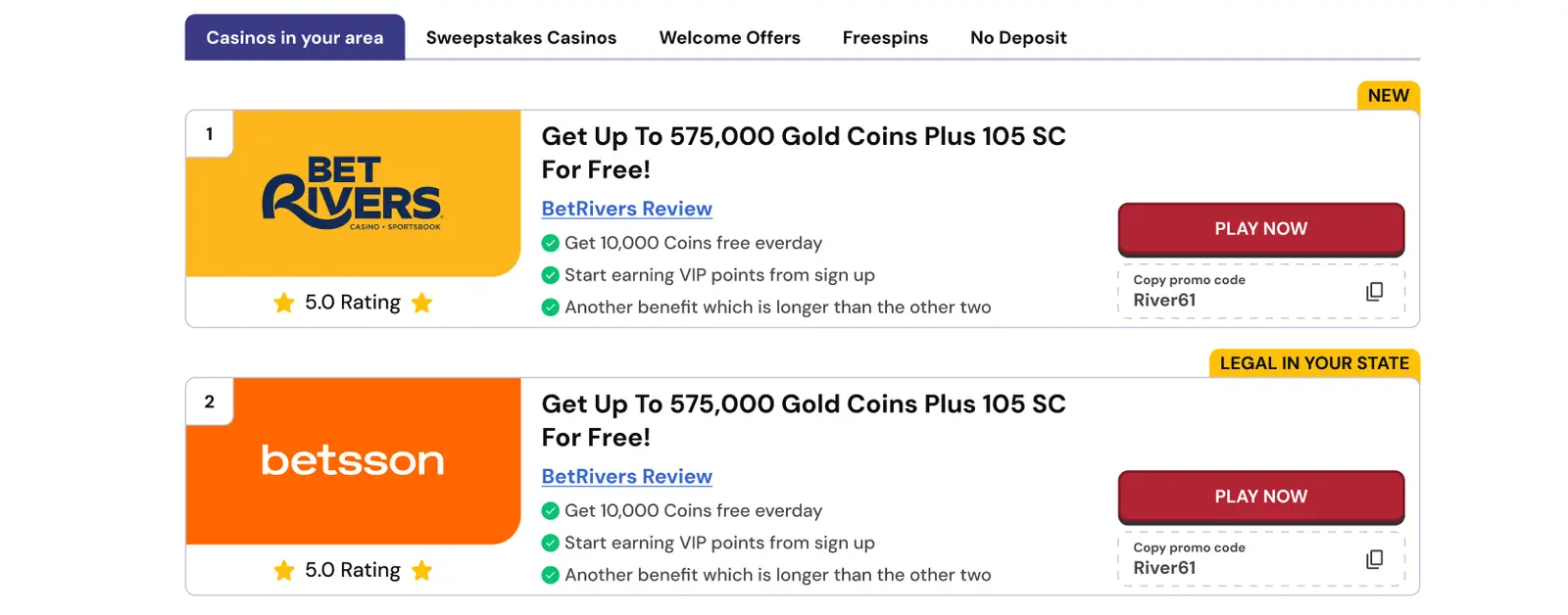
A recurring problem across multiple affiliate pages was that toplist cards presented all offer types together, real-money casinos, sweepstakes, welcome offers, free spins, without helping users navigate by intent. The tabs feature proposal introduced category tabs above the toplist to create clearer content segmentation. The tab structure separates user intents into distinct groups, surfaces contextual trust cues ("Legal in your state") directly on the card, and reduces the scroll required to find the right offer type.
Dynamic search, PlayUSA & LSR
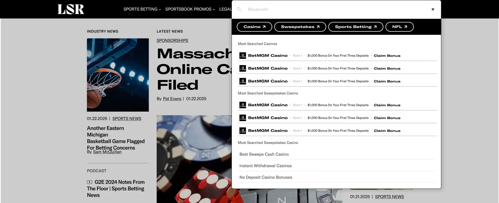
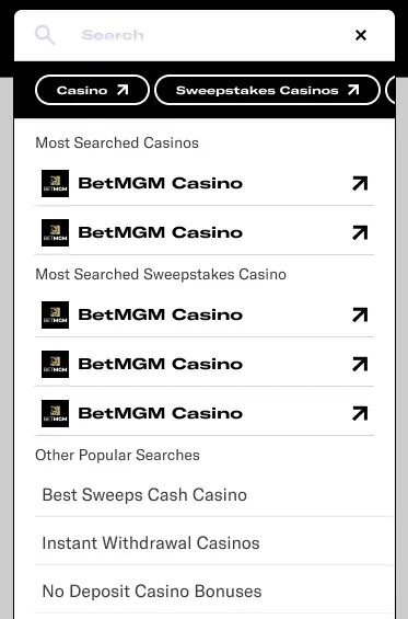
Neither PlayUSA nor LegalSportsReport had functional site search. Users arriving for a specific state, operator, or promo code had to navigate complex menu structures or rely on external search engines. This was a significant friction point for high-intent users, the users most likely to convert.
I designed the dynamic search overlay for both products: a full-screen layer with categorised filter chips (Casino, Sweepstakes, Sports Betting, NFL) and live suggestions that surface operators with rank, bonus information, and a direct CTA. The LSR version was extended to include operator rank metadata and "Claim Bonus" actions inline in the search results, turning the search interaction into a monetised touchpoint rather than a pure navigation aid.
Geo-targeting, US State Map
The most strategically significant product innovation in this area was the US State Map: an interactive geo-targeting layer that detects a user's state and routes them to the most relevant betting experience. The map answers the user's first question, "Is this legal where I live?", before asking for any commitment.
Beyond the trust function, the map serves as a dynamic geo-targeting engine: users landing from regulated states are routed directly to state-specific pages, shortening the homepage → state → operator funnel and improving both SEO engagement signals and conversion efficiency. The feature combines compliance, UX, SEO, and commercial optimisation into a single homepage component, exactly the kind of systems-level thinking that cannot be achieved by optimising UI in isolation.
Channelizer V2, transparency-first alternative architecture
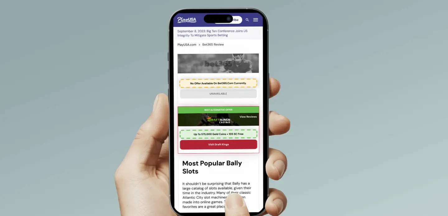
When operators became unavailable in specific states due to regulatory changes, high-traffic review pages were left presenting content that couldn't legally convert. The existing system showed one forced alternative with no explanation, and high-intent branded traffic, already committed to a specific operator, experienced this as bait-and-switch. Bounce without conversion.
Channelizer V2 (DES-688) was designed around a different principle: structured choice increases conversions; a single forced path reduces trust and increases bounce. The redesign introduced up to three alternative operators, a clear availability message, and two design options matched to different scenarios.
Option A (Full-Width Interruption) places a large availability banner below the page H1 with three horizontal alternative cards. It communicates "This brand is not licensed in your state. Here are the best legal options." Maximum transparency, maximum above-the-fold visibility. Best for geo-blocked states where legal separation must be immediate and unambiguous.
Option B (Left Column Integration) replaces the bonus module in the left column with vertically stacked alternatives while leaving review content dominant. Better for "demon" cases, where the brand is technically accessible but not currently monetisable, since a full-width interruption would feel misleading in that context.
The recommendation was scenario-dependent: geo-blocked states use Option A; demon brands use Option B; sweepstakes-to-sweepstakes routing works with either. This is the thinking that turns a CTA component into a revenue protection system, not one solution applied universally, but a framework matched to user intent and commercial context.
Sportsbook offer modules, LSR
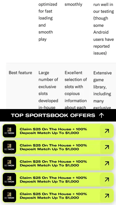
The sticky sportsbook offer bar on LegalSportsReport solves a specific conversion problem: users arrive for comparison content, scroll through dense comparison tables, and lose the CTA as they go deeper into the page. The sticky bar ensures the primary conversion action stays accessible throughout the session without interrupting the reading experience.
The toplist toggle (Sportsbooks / Casinos / Social & Sweepstakes) was added to expand cross-sell opportunities. Users on a casino review page now have immediate access to sportsbook alternatives without navigating away, creating discovery paths that the previous flat structure did not allow.
Navigation, Lineups, Gaming Today, PlayUSA
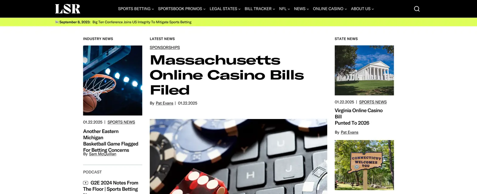
Navigation improvements ran across multiple products simultaneously. For Gaming Today, the work involved restructuring the mega-menu to surface high-value categories at the top level and establishing jumplink navigation on long-form content pages, reducing scroll friction for users arriving with a specific question. For PlayUSA, the navigation was restructured with clearer categorisation that matched user mental models rather than editorial publishing structure.
For Lineups, the mobile navigation was identified as a more fundamental problem: a flat accordion that flattened a deep multi-sport content hierarchy into a single-level list. Key destinations required 3-4 taps to reach. The proposed redesign introduced a persistent sidebar/drawer that shows sport-level navigation alongside one layer of sub-navigation simultaneously, reducing tap depth to two, and aligning mobile and desktop navigation logic into a single shared component.
Dynamic contrast engine, accessibility as governance
The most governance-forward work in the accessibility space was the dynamic text contrast validation engine. Regional sites across the portfolio were rendering white text on light backgrounds and black text on dark backgrounds, not because of poor design choices, but because CMS-driven content changes background colours dynamically. No system existed to detect contrast failures at render time.
The proposed solution was a rule-based contrast engine that automatically determines whether text should be black or white based on the live background at render time, enforcing WCAG contrast thresholds without requiring engineering review of every content change. This is accessibility governance enforced by system logic, not by checklist. It removes the dependency on designers or engineers catching contrast failures, making compliant output the default outcome of any content change.
Outcome
Qualitative assessment of the work.
The trust-before-offers principle was applied consistently across PlayUSA, Gaming Today, and LegalSportsReport, giving page decisions a shared framework to be evaluated against rather than individual taste.
Dynamic search was designed to turn a navigation liability into a monetised touchpoint. Channelizer V2 was designed to turn previously dead pages, where regulatory changes had severed the conversion path, into structured choice experiences that recover commercial value without compromising user trust. The US State Map unified three independent business objectives (compliance, SEO, conversion) into a single product component.
The navigation architecture work across Lineups, Gaming Today, and PlayUSA was designed to reduce the tap depth and cognitive load required to reach high-intent content, with direct implications for engagement, session duration, and conversion. The proposed dynamic contrast engine would remove a class of compliance risk that previously required manual review of every CMS-driven content change. The sticky sportsbook offer bar and toplist toggle introduced cross-sell surface area that did not previously exist.
More broadly, this body of work established that commercial optimisation is a systems problem, not a design problem. The organisations that benefit most from CRO work are the ones where every page decision is governed by a shared framework, not improved one page at a time.